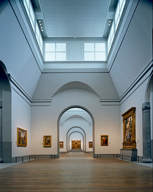
This reading taught me a lot about spatial planning and the layout within a space. The two spaces that are explored look into their purpose as galleries and the actual artwork in each space. Both of the spaces appear to be completely to one another, the Sainsbury wing has two intersecting axes and Castelvecchio has an accentuates axial layout, he also focused on the genius loci. I find it interesting how the flow of the building and flow around the space can be as exciting as the actual artwork itself. It has helped me with my Design Studio module when it comes to the layout of my gallery space, and how important the way around the space is, and the impact it has on the experience. Also gives more of an understanding how to break up the space into smaller areas, especially when it comes to a larger area sometimes it can feel more challenging when there are ways to achieve it whilst taking the foot flow into consideration.
 RSS Feed
